Click on the image to open the website itself.
The sites will all open into the same new window.
--
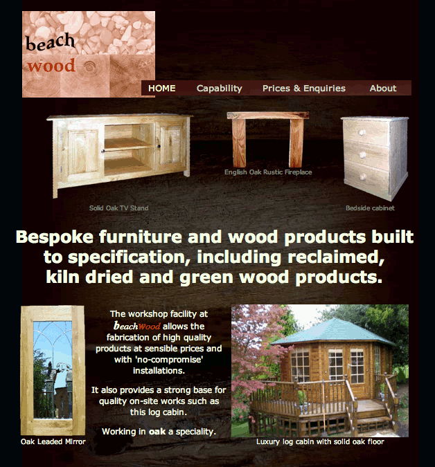 This website is to a style defined by the customer. The dark background (not quite black) enhances the effect of the pictures.
The pictures pop-up to reveal more in a slide-show effect. There is a contact form. The logo was provided by the customer and scaled for the page.
--
--
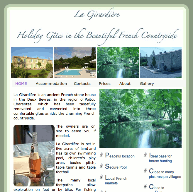 This website is to a style suggested to the customer. The curved border is the same with on every page but the height varies.
On the front page, the larger picture shows each smaller one as the mouse passes over it. On other pages the pictures pop-up in a slide-show effect. There are contact details; address, map, email, phone and a form. There is a page describing the area with links out to other websites of interest. There is an extensive picture gallery.
--
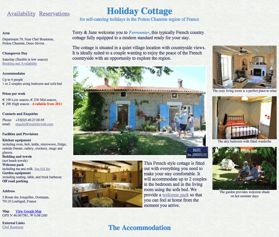
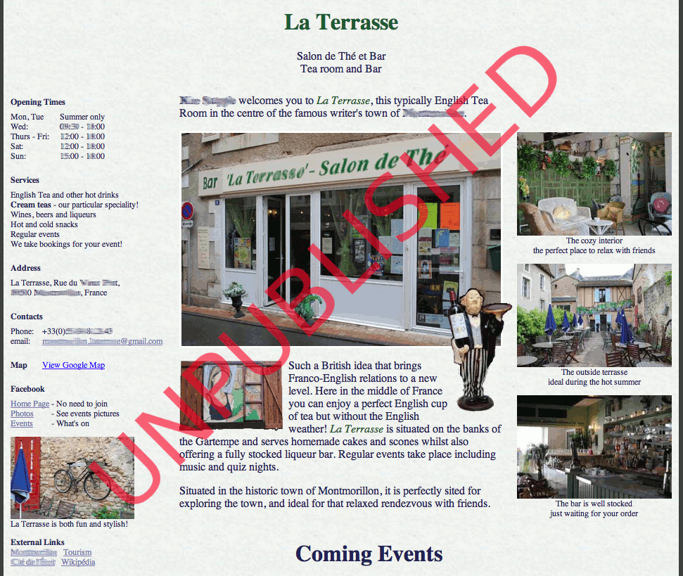
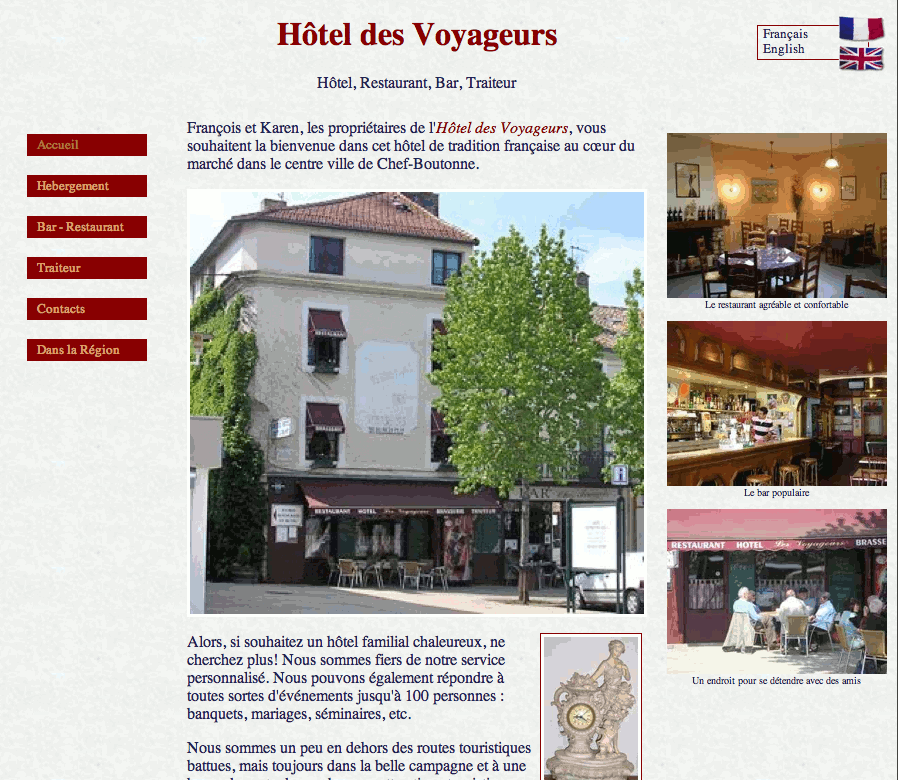
Both sites include key details and a map link on the left edge.